
Update from May 19, 2023:
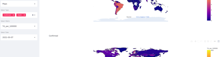
The dashboard is now disabled as of today. Corona is officially over. Numbers are no longer collected (see the screenshot of the dashboard before it was disabled).
Everyone is tired of Corona and simply wants to move on. However – up to now – Corona has persisted. Incidentally, my first version Corona dashboard has now been running for more than a year. I’ve therefore decided to give it a makeover.
The code is available on github : GitHub – hfwittmann/covid19-dashboard: Covid19 Dashboard with Maps, Timeseries and Automated Predictions
The salient features of the new dashboard are:
- Simplicity
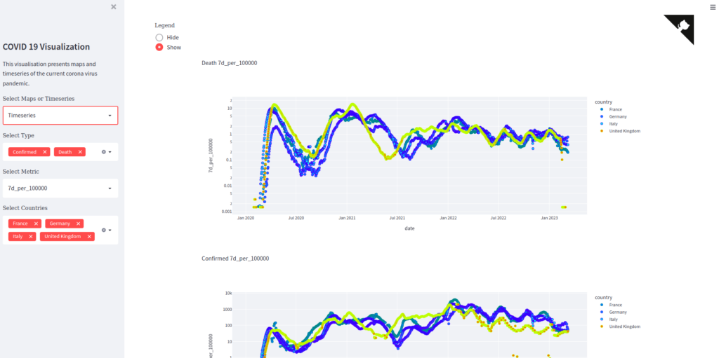
- the basic numbers are now 7 day incidence rate averages, single day numbers are not shown anymore, as they are noisy and hard to read.
- Meaning
- The incidence rate averages are calculated by taking country population figures into account
- I have introduced a new trend indicator 7d/28d
- Technical overhaul
- the entire app has been split into a front-end and back-end, the frontend -as before- uses streamlit, with the back-end supplying the data via a rest API.
Pingback: Corona dashboard – Artificial thoughts